


MASHIRO
We were in charge of the brand identity and logo design for MASHIRO, a studio where you can encounter gemstones that truly resonate with you. The brand name derives from the Japanese word “真白 (mashiro)”, which means “pure white.”

Each gemstone holds within it a unique world shaped over millions of years by the Earth itself—characterized by cracks, bubbles, gradients, and mineral inclusions. Far from uniform, these natural details are what make each gem so deeply individual and lovable the more you observe them.
Rather than approaching jewelry with the commercialized aesthetic rooted in Western tradition, MASHIRO celebrates the raw, unfiltered individuality of gemstones born in natural environments. The studio is designed as a pure white space, inspired by natural light, to spotlight the world contained within each stone.

By focusing on these intrinsic characteristics—what we call inclusions—MASHIRO offers a unique experience: discovering a gemstone that truly draws you in, and wearing it as an expression of your personal values and inner world.

惹かれる宝石に出会えるスタジオ、MASHIROのロゴデザイン、ブランドアイデンティティの構築を担当しました。ブランドのネーミングの由来は日本語の「真白」。

コンセプトは、「自然からの祝福」。クラック、気泡、グラデーション、鉱物。地球が数百万年単位という気が遠くなる時間をかけて作り出した宝石のひとつひとつは本来画一化されているものではなく、石それぞれに個性があり、唯一無二で見れば見るほど愛しくなるもの。 そんな宝石の中の個性(=内包物)を最大限に伝えるべく宝石の中に世界観を見出し、自然光をイメージした真っ白なスタジオで宝石の中にフォーカスを当てました。
西洋の歴史において発展したような商業的なアプローチや世界観で魅せるジュエリーとは異なり、自然環境で生まれた宝石本来が持つ唯一無二の個性を発掘し、人の個々の価値観にマッチする「惹かれる宝石を身にまとう体験」を提供するブランドです。


PROCESS
Before the photography, I had the opportunity to accompany a gem dealer to closely observe each gemstone. What I discovered was a unique world residing within each stone. During the subsequent shoot, we intentionally avoided creating a surrounding context, instead allowing the gemstones to shine in a clean, natural light that emphasizes their inherent beauty. We replicated natural light in the studio and adjusted the angles and lighting to showcase each gem at its most attractive, capturing the essence of its individuality.写真を撮影する前に、実際に宝石商のスタジオに同行させていただき、宝石を手元で観察しました。間近で一つひとつの宝石を観察する中で見えたものは、その宝石そのものの中に宿る唯一無二の世界観でした。後日の撮影では、宝石の周りに世界観をつくることはあえてせず、自然光をイメージするクリーンな世界観の中で宝石の中にある鉱物にフォーカス。スタジオで自然光を再現して撮影し、その宝石が最も魅力的に見える角度、光の入れ方を調整しながら、最も美しく個性を引き出せた写真を採用しました。


LOGO
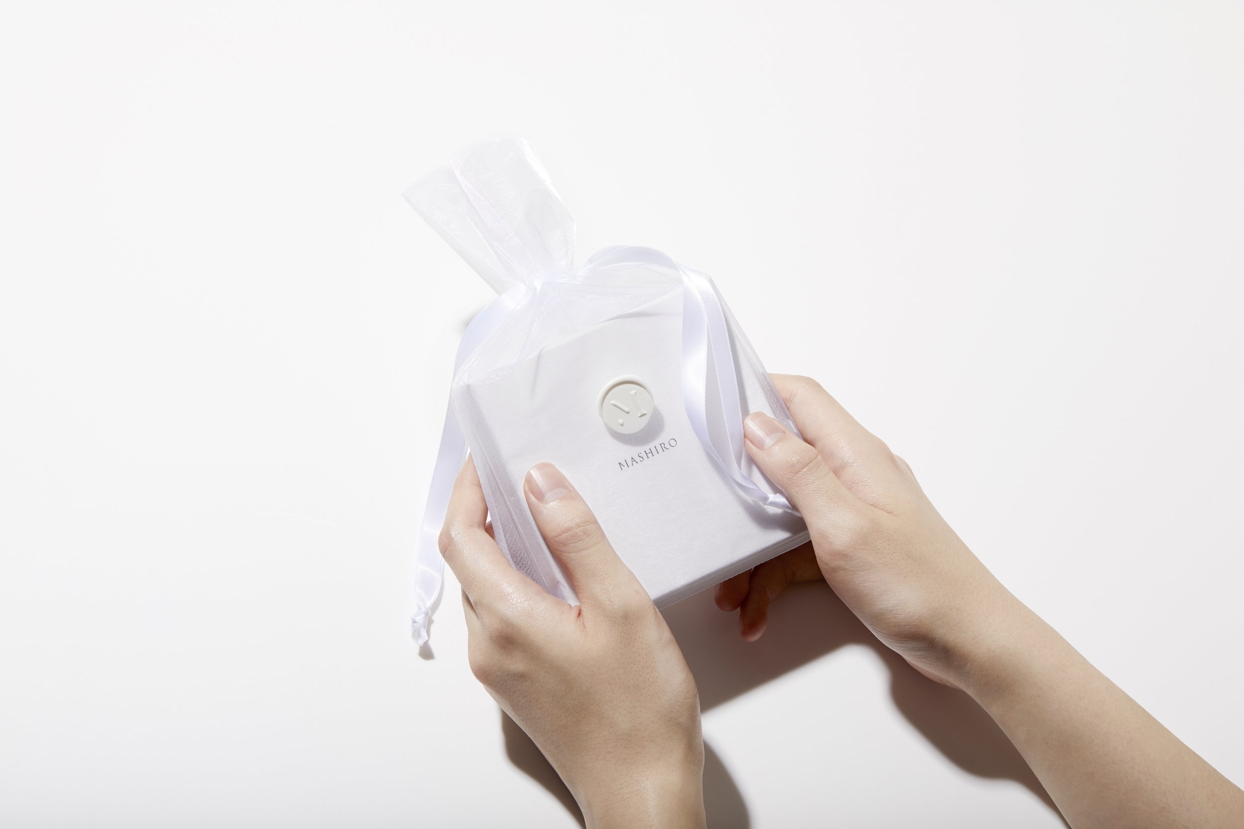
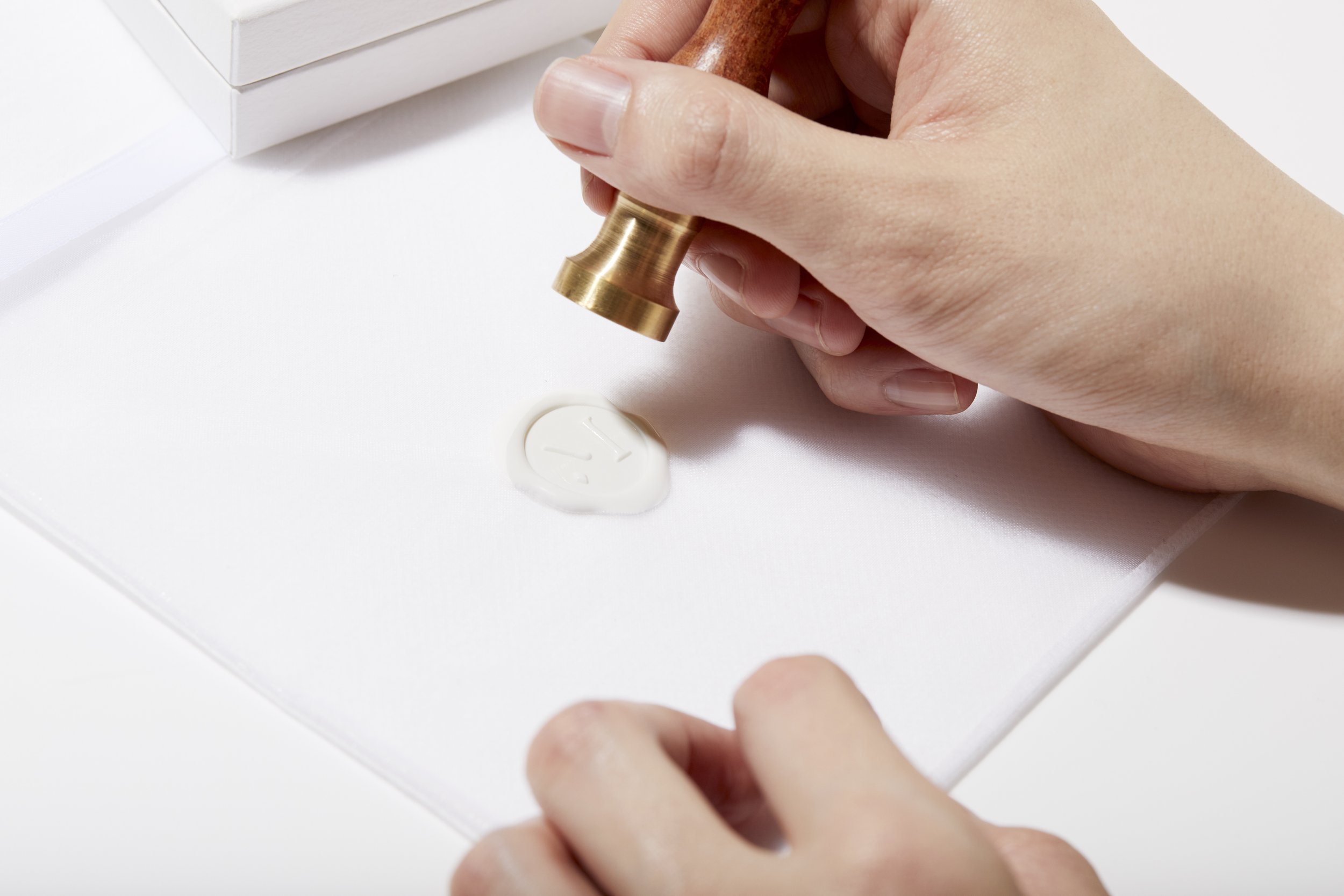
The shape of the "M" in the MASHIRO logo is composed of minerals from buried gemstones. Over time, these minerals transform into the "M," eventually leading to encounters between people and these precious stones through mining. By intentionally omitting parts of the "M," we express the unknown meeting between humans and gemstones. The circle is not a perfect round but features variations in thickness, representing the organic nature of the environment.MASHIROのロゴのMのシェイプは、地中に眠る宝石の鉱物から成ります。これらが時間の経過とともにMへと変化し、やがて採掘によって人と出会うのです。Mを欠損させることで、人と宝石の未知なる出会いを表現。円はあえて真円ではなくして太さにもゆらぎを作ることで、有機的な自然を表現しています。封蝋シールにもなるエンブレムは黄金比によって構成。
アクセサリーに刻印されるMASHIROのタイポグラフィは、ローマ帝国時代から愛されたフォントであるTRAJANをベースに構成。歴史を感じさせるフォントです。MASHIROは、宝石のリメイクも行っています。惹かれる宝石が、このフォントと共に永く残るように、という願いを込めました。Cliant : MASHIRO inc. 2022-23producer / director
concept
logo design
photograph
art direction
Kuro, Norimasa Sakai
Koki Kakehashi
Shiho Tanino
Satoko Munetaka
Koki Kakehashi, Shiho Tanino
ONLINE SHOP
https://mashirojewelry.com
instagram
@jewelry_mashiro
Scope of Work
01 marketing research
02 building concept
03 making logo
04 art direction (except for web site)